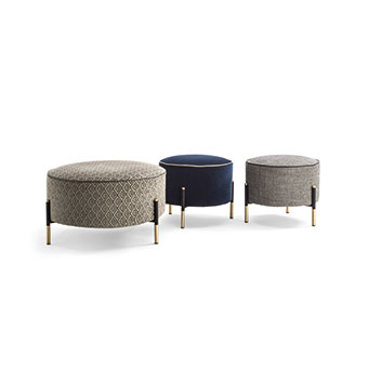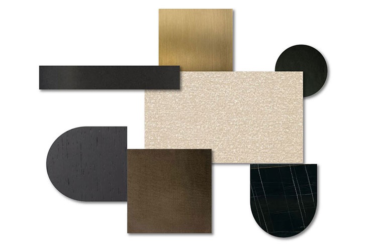
Composition: Verniciatura a polvere a base di resine sintetiche con texture leggermente in rilievo.
Tipology: Metallo verniciato.
TECHNICAL CHARATERISTICS: Finitura resistente a screpolature e scolorimento.
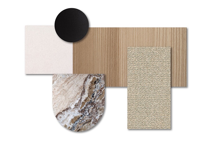
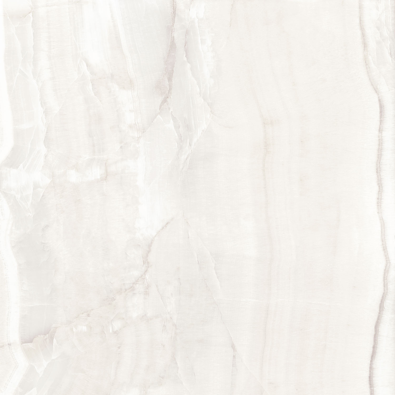
Composition: Materiale a pasta compatta, dura non porosa ottenuto tramite processo di sinterizzazione di materie prime che vengono atomizzate fino a raggiungere la pressatura desiderata.
ASPECT: Lucido.
Tipology: Materiale composito di origine complessa.
TECHNICAL CHARATERISTICS: Resistenza, ridotta capacità di assorbimento di acqua, durevolezza.
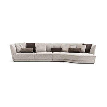
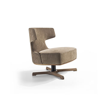
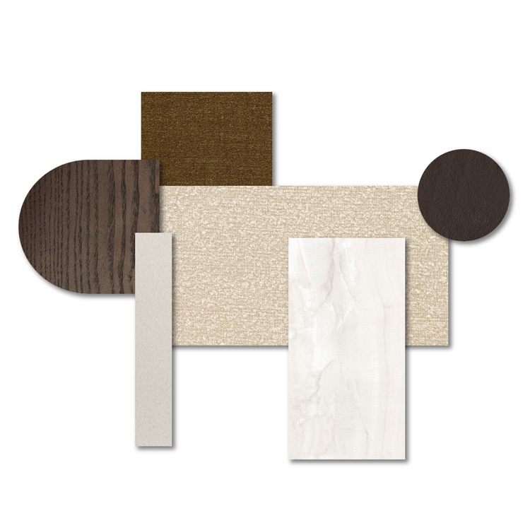
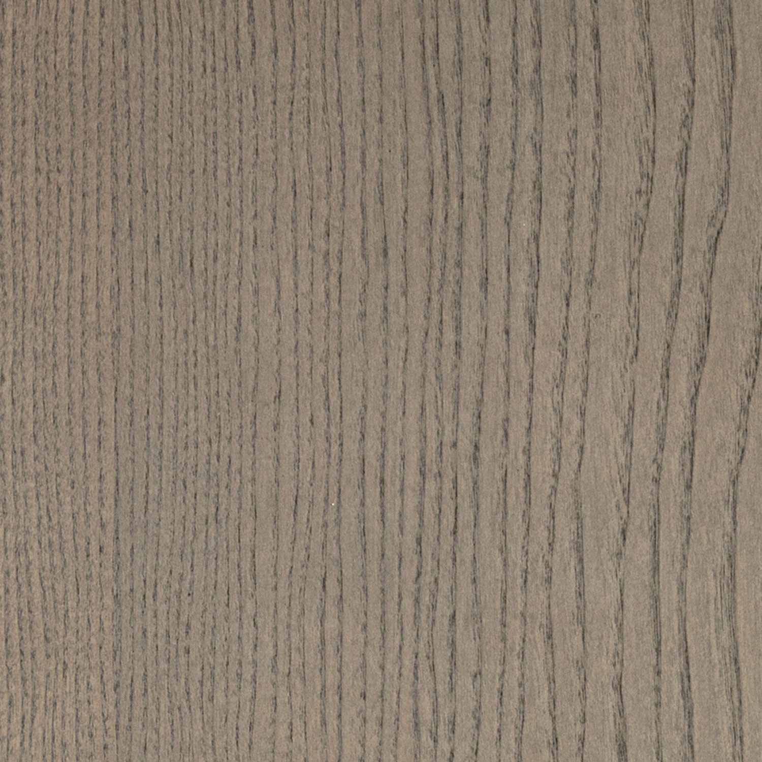
Composition: Il legno massello viene ricavato dal “cuore” del tronco dalla parte più resistente e massiccia (durame).
Tipology: Legno massello di frassino color greige.
TECHNICAL CHARATERISTICS: Materiale resistente e durevole.
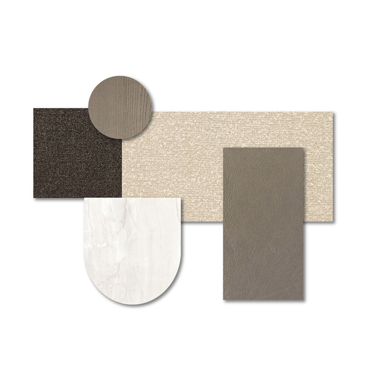
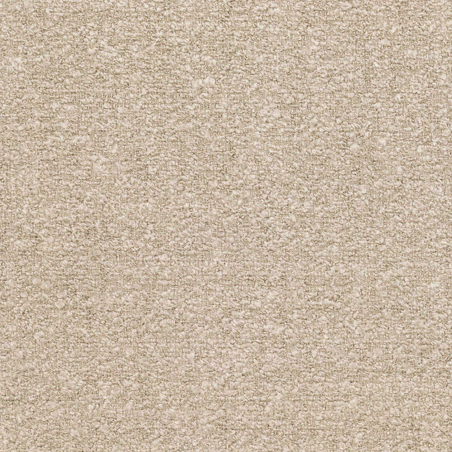
Composition: 47% PC – 22% PL – 11% VI – 20% CO
Martindale: 40.000
Pilling: 4 / 5
FABRIC WIDTH: 140 cm
MAINTENANCE:
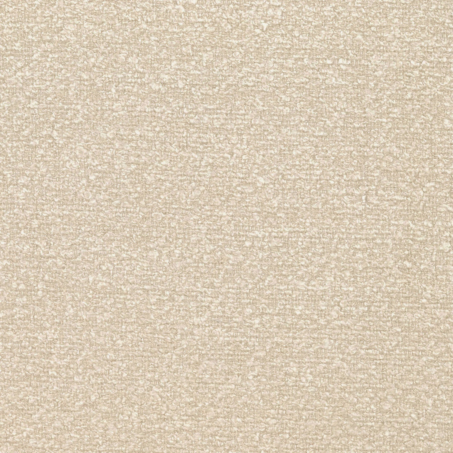
Composition: 47% PC – 22% PL – 11% VI – 20% CO
Martindale: 40.000
Pilling: 4 / 5
FABRIC WIDTH: 140 cm
MAINTENANCE:
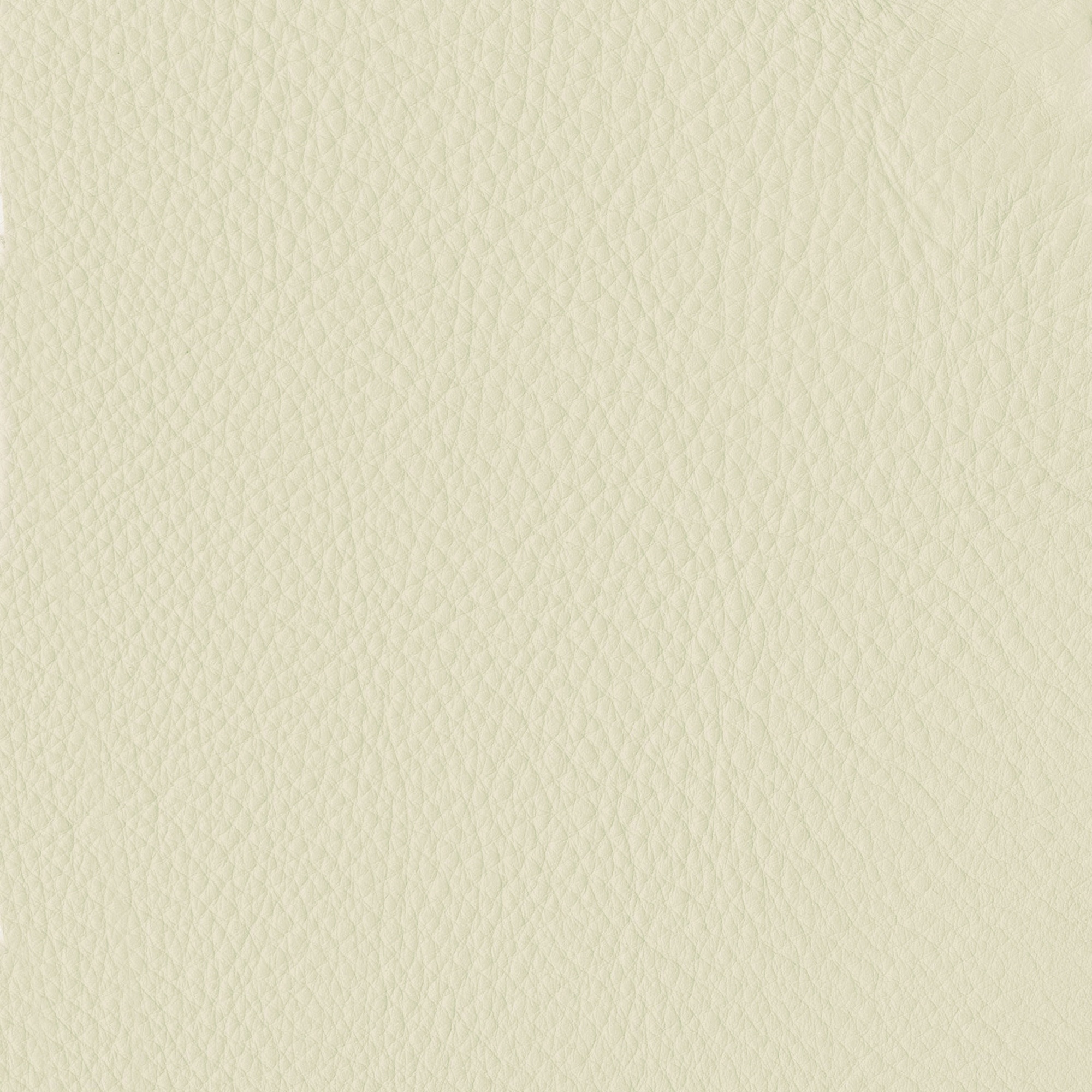
AVERAGE LIGHT FASTNESS: ≥ 4 scala dei blu
HIDE TYPE: Bovino Europeo
TANNING: Minerale
EFFECT/SURFACE: Pigmentata grana naturale
THICKNESS: 1,2 -1,4 mm
AVERAGE SIZE: ≥ 5,00 mq
FRICTION: secco ≥ 1000 cicli – umido ≥ 250 cicli
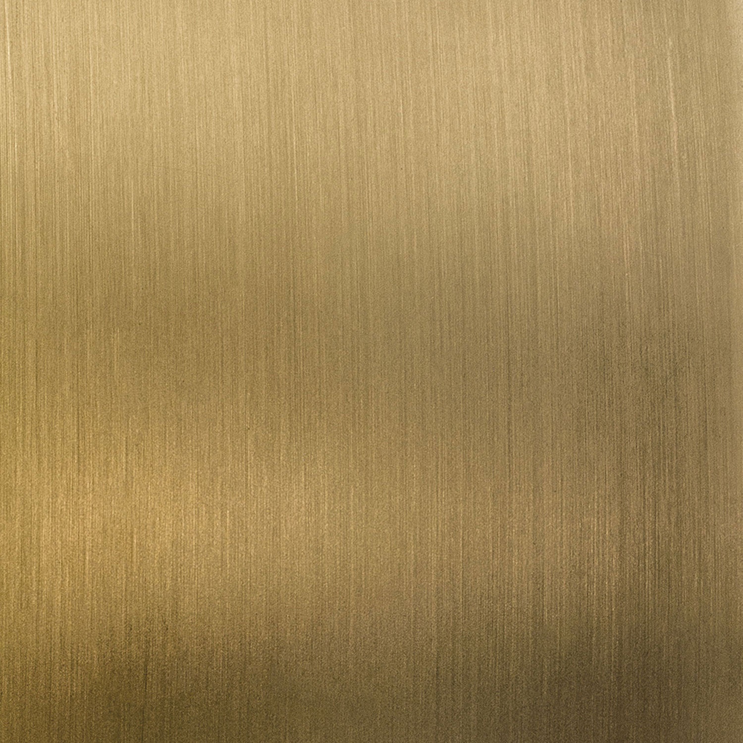
Composition: Cromatura attraverso procedimento galvanico su base metallica satinata.
Tipology: Metallo cromato effetto satinato.
TECHNICAL CHARATERISTICS: Indurimento superficiale del materiale.
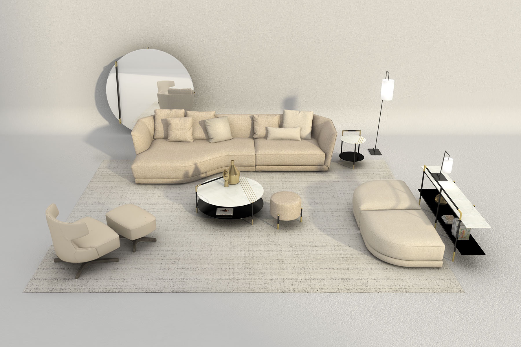
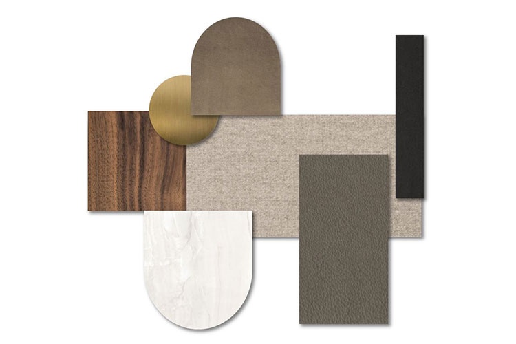
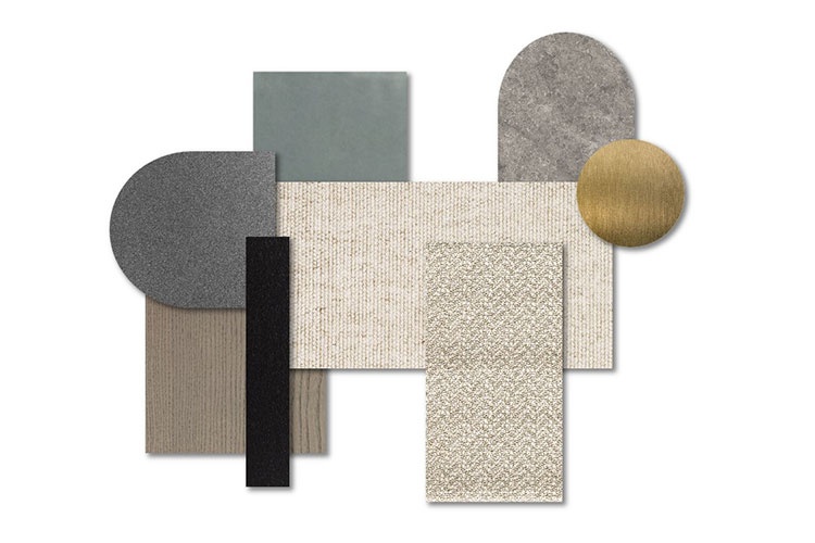
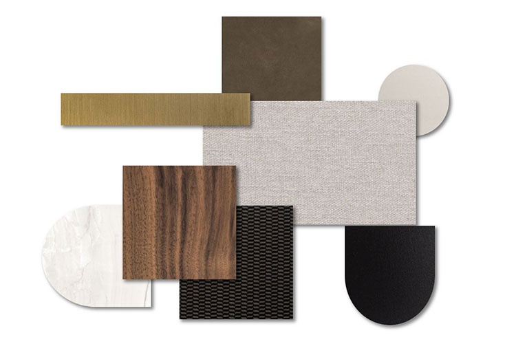
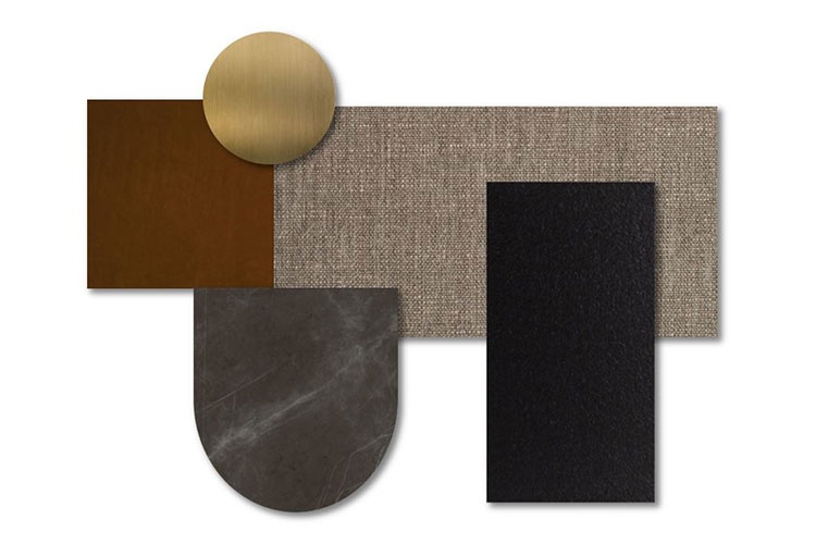
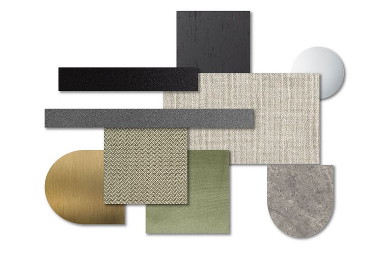
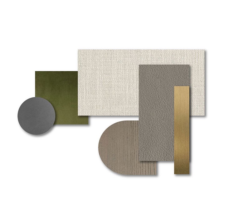
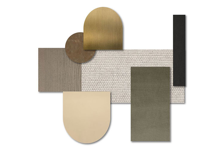
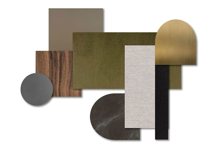
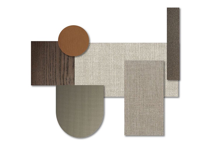
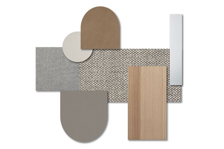
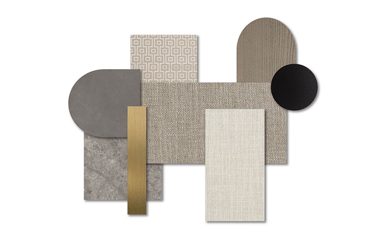
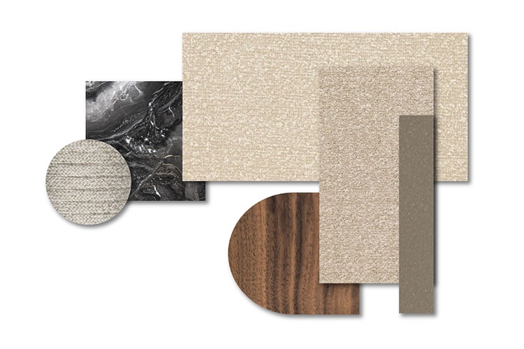
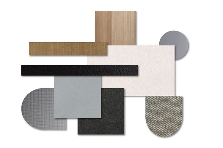
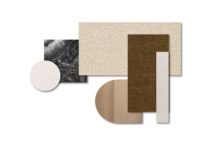
LIGHT HARMONY