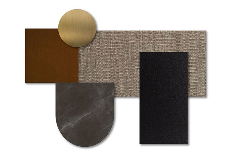
Composition: Cromatura attraverso procedimento galvanico su base metallica satinata.
Tipology: Metallo cromato effetto satinato.
TECHNICAL CHARATERISTICS: Indurimento superficiale del materiale.
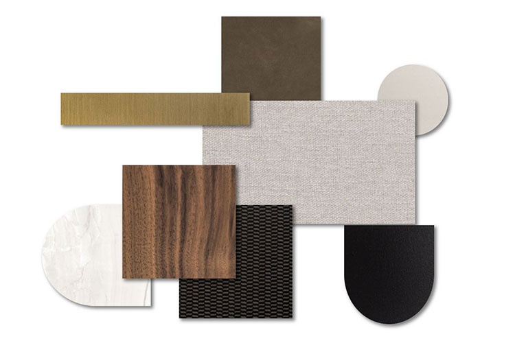
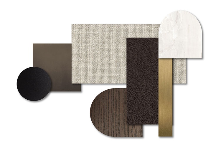
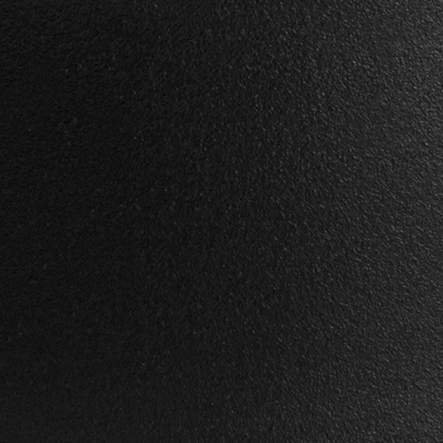
Composition: Verniciatura a polvere a base di resine sintetiche con texture leggermente in rilievo.
Tipology: Metallo verniciato.
TECHNICAL CHARATERISTICS: Finitura resistente a screpolature e scolorimento.
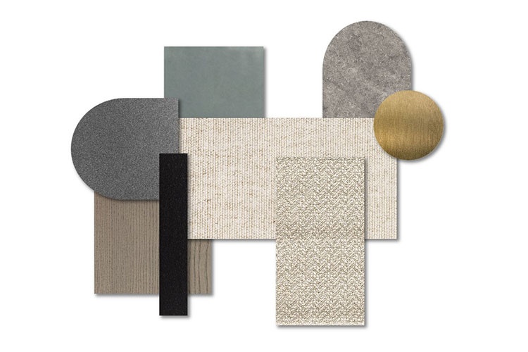
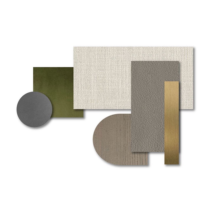
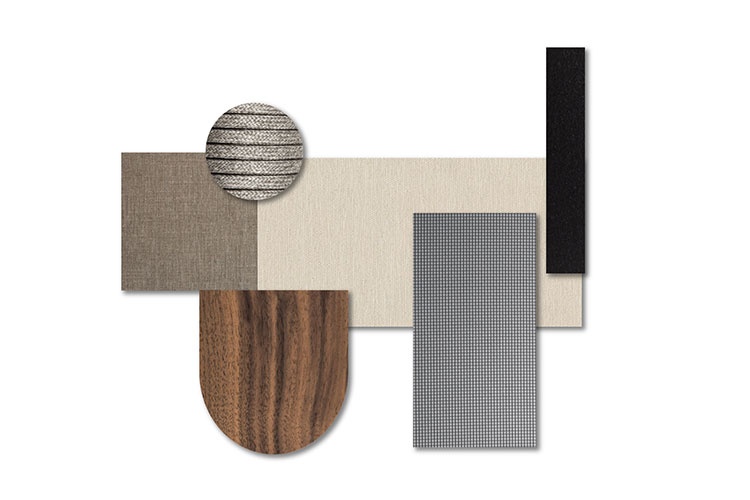
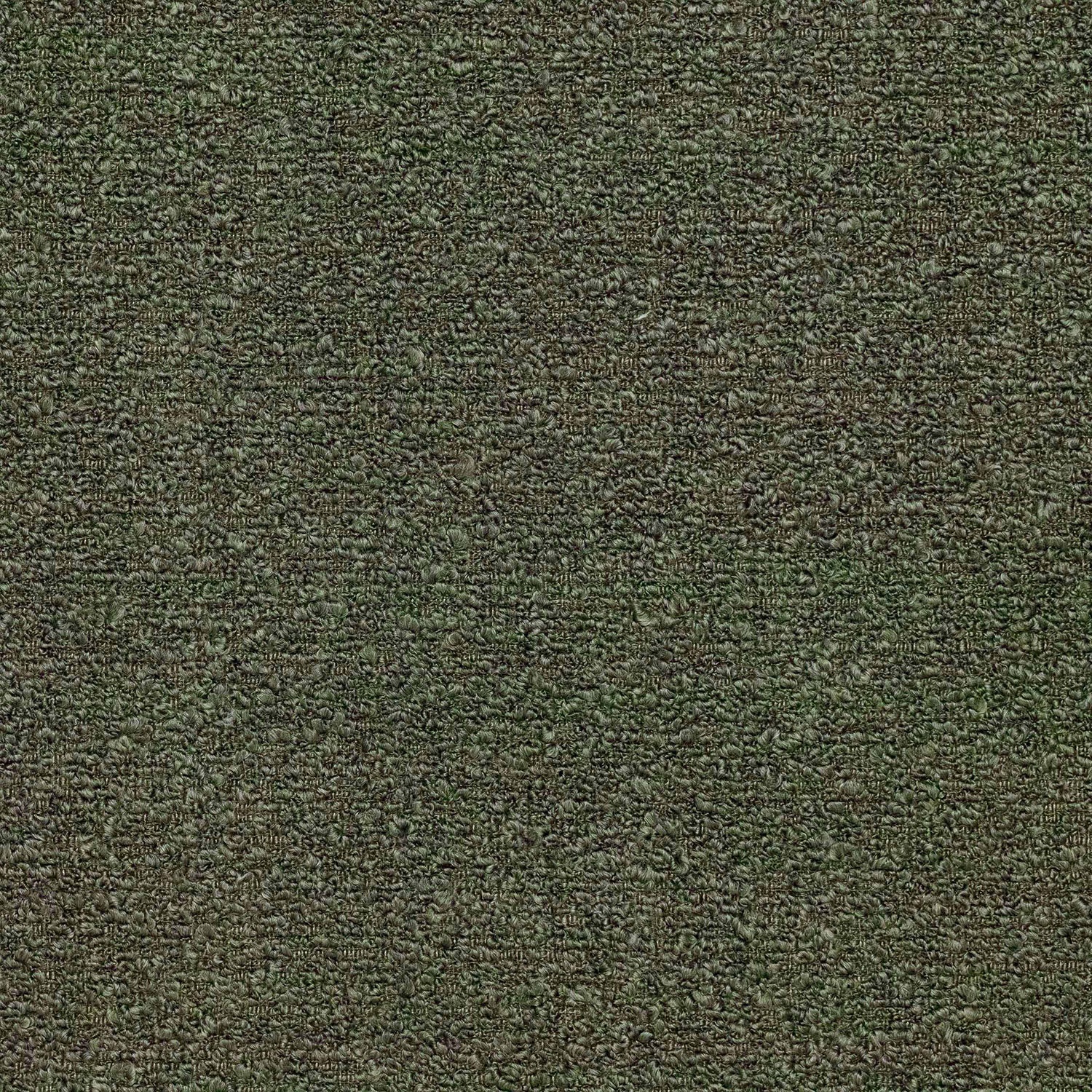
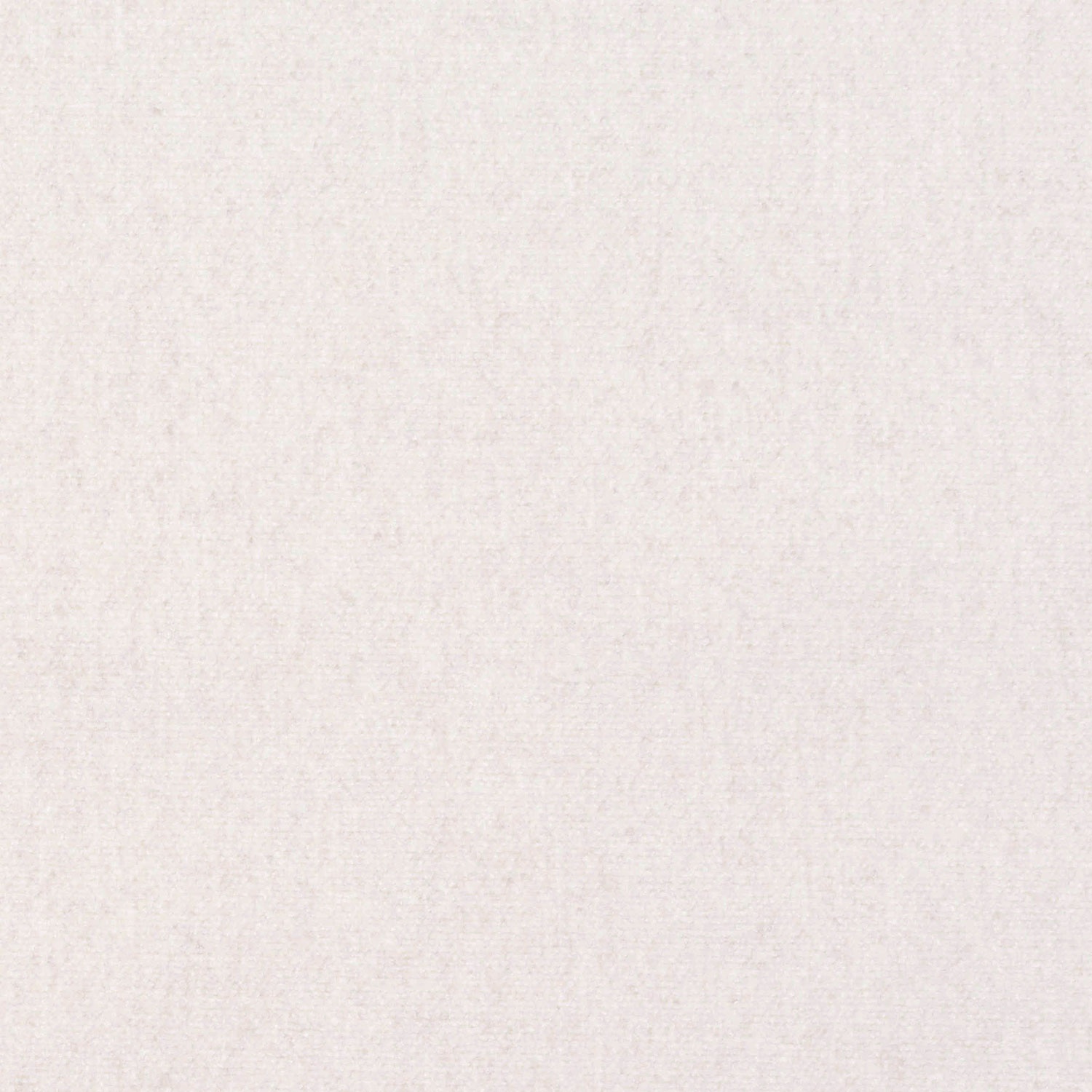
Composition: 47% PC – 22% PL – 11% VI – 20% CO
Martindale: 40.000
Pilling: 4 / 5
FABRIC WIDTH: 140 cm
MAINTENANCE:
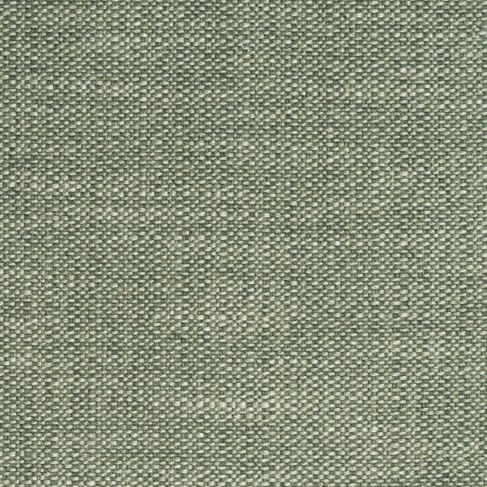
Composition: 36% VI – 32% LI – 24% PC – 4% PA – 4% PL
AVERAGE LIGHT FASTNESS: 3 /4
Martindale: 25.000
FABRIC WIDTH: 140 cm
MAINTENANCE:
Composition: 32% PC – 29% CO – 26% VI – 10% LI – 3% PL
AVERAGE LIGHT FASTNESS: 4 / 5
Martindale: 30.000
FABRIC WIDTH: 140 cm
MAINTENANCE:
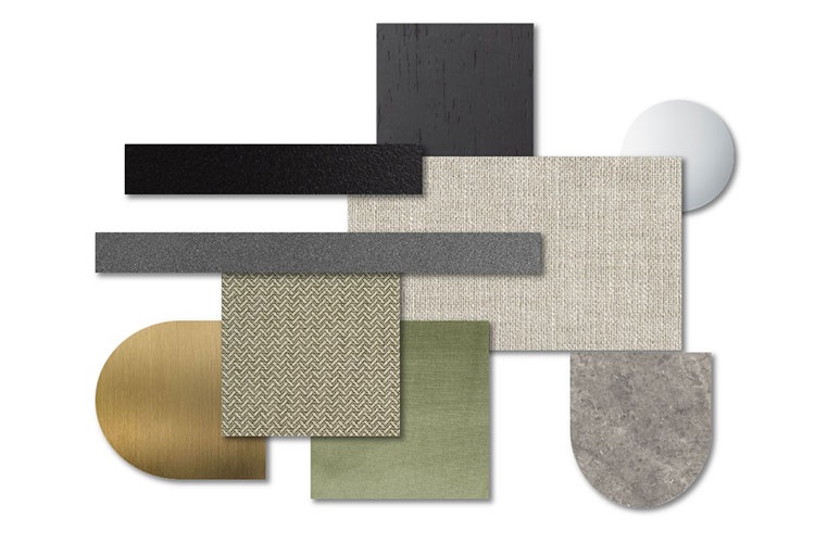
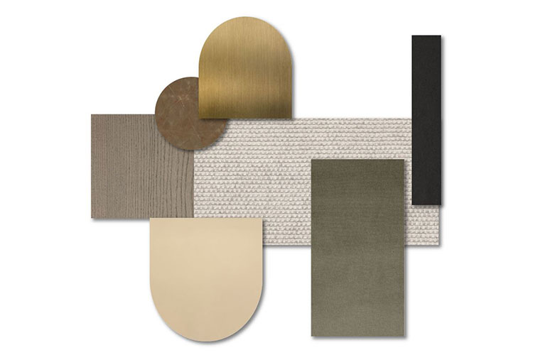
Composition: Verniciatura a polvere a base di resine sintetiche con texture leggermente in rilievo.
Tipology: Metallo verniciato.
TECHNICAL CHARATERISTICS: Finitura resistente a screpolature e scolorimento.
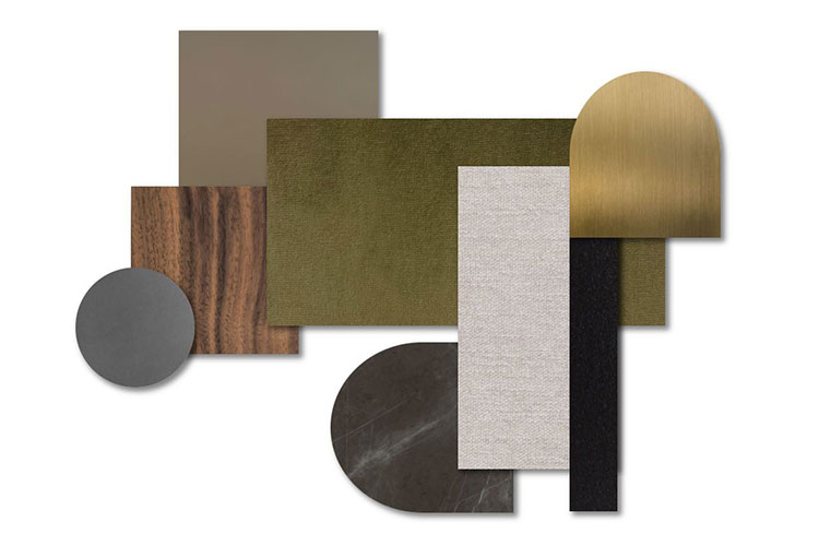
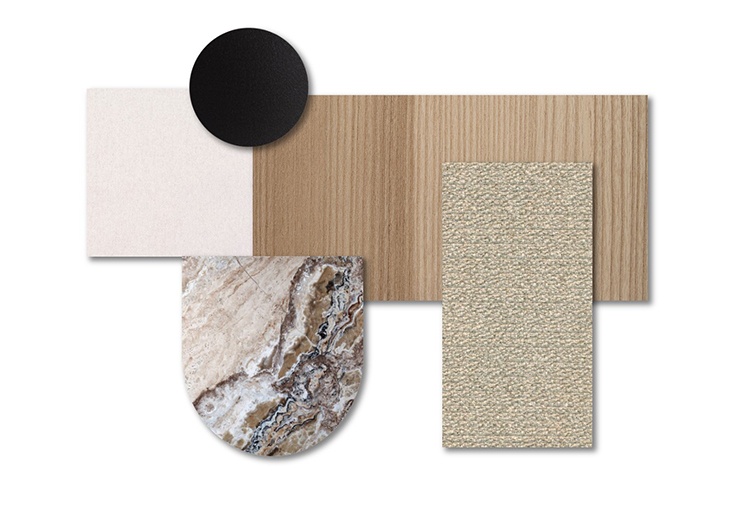
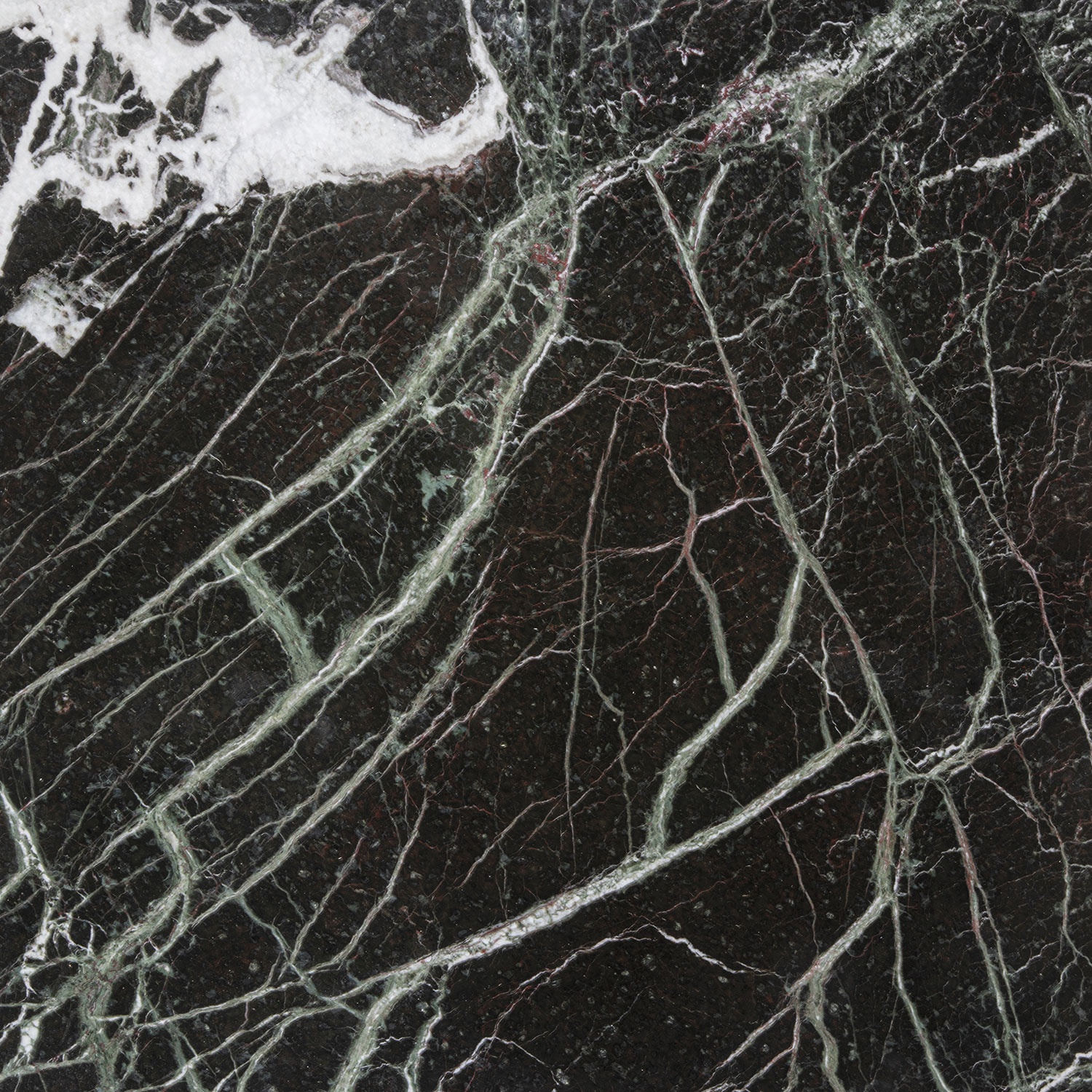
Composition: Processo metamorfico di rocce sedimentarie che provocano una ricristallizzazione del carbonato di calcio con diverse nature.
ASPECT: Lucido o opaco.
Tipology: Materiale di origine naturale sedimentaria.
TECHNICAL CHARATERISTICS: Durevolezza, eventuali irregolarità superficiali e scarsa resistenza alle sostanze acide essendo di natura calcarea.
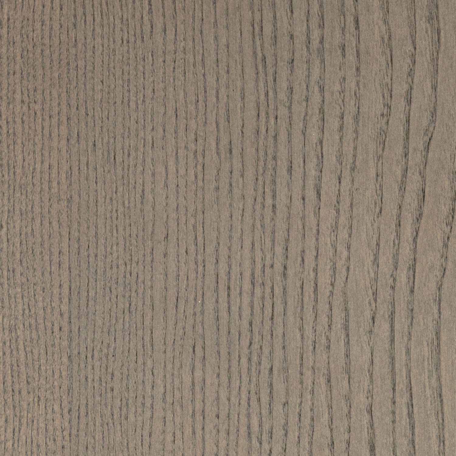
Composition: Il legno massello viene ricavato dal “cuore” del tronco dalla parte più resistente e massiccia (durame).
Tipology: Legno massello di frassino color greige.
TECHNICAL CHARATERISTICS: Materiale resistente e durevole.
LIGHT HARMONY | 13