
Composition: Solidificazione di un liquido contente silice sotto forma di sabbia e soda in forma di carbonato o solfato.
Tipology: Materiale di natura amorfa ottenuto tramite la solidificazione di un liquido senza cristallizzazione.
TECHNICAL CHARATERISTICS: Resistenza.
AVERAGE LIGHT FASTNESS: ≥ 4 scala dei blu
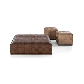
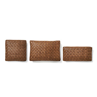
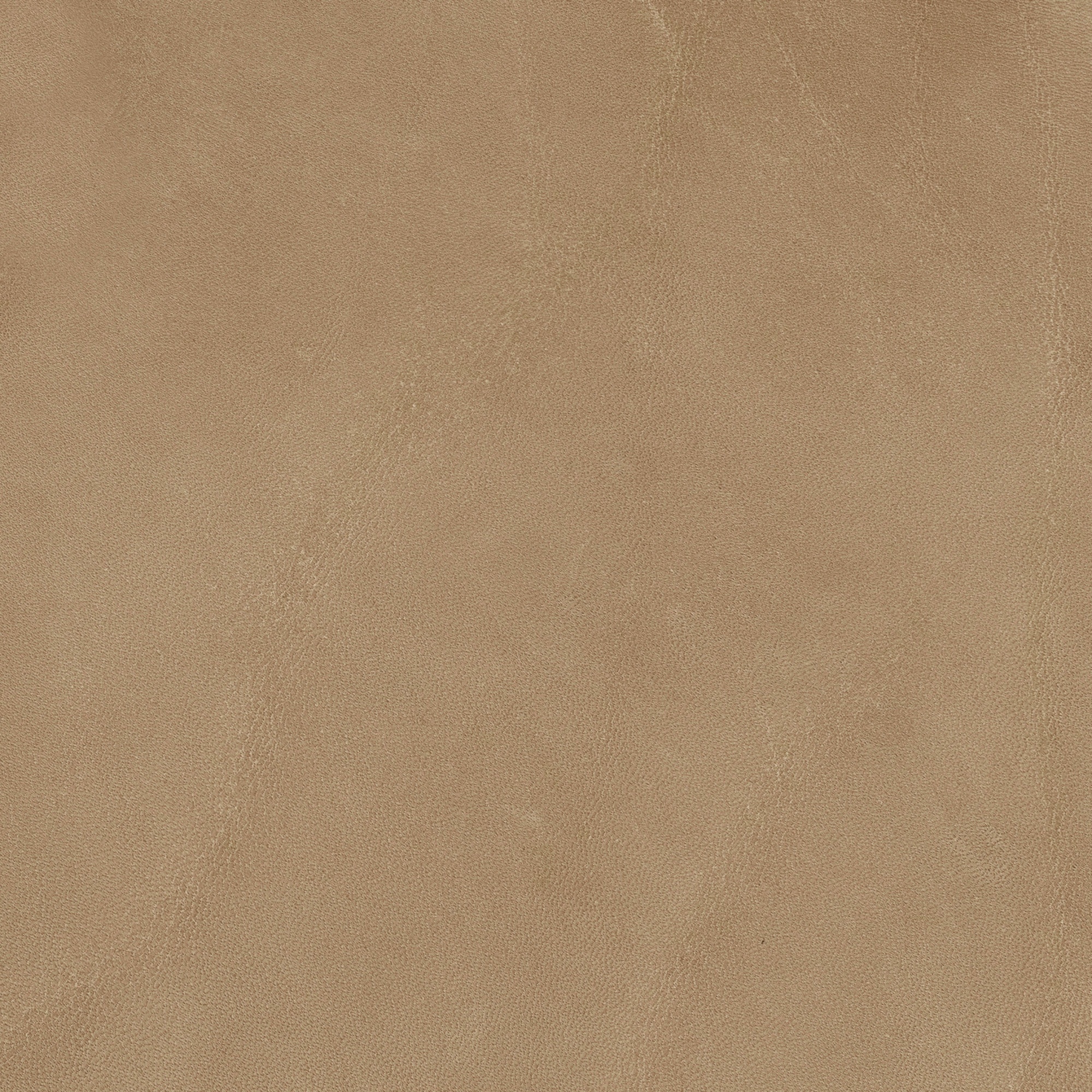
HIDE TYPE: Bovino Europeo
TANNING: Minerale
EFFECT/SURFACE: Pigmentata grana naturale
THICKNESS: 1,2 -1,4 mm
AVERAGE SIZE: ≥ 5,00 mq
FRICTION: secco ≥ 1000 cicli – umido ≥ 250 cicli
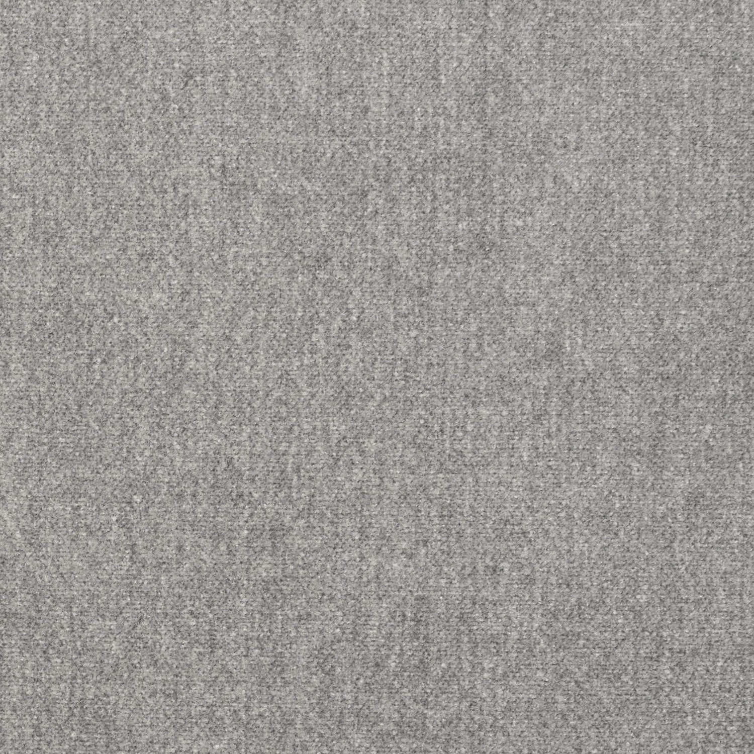
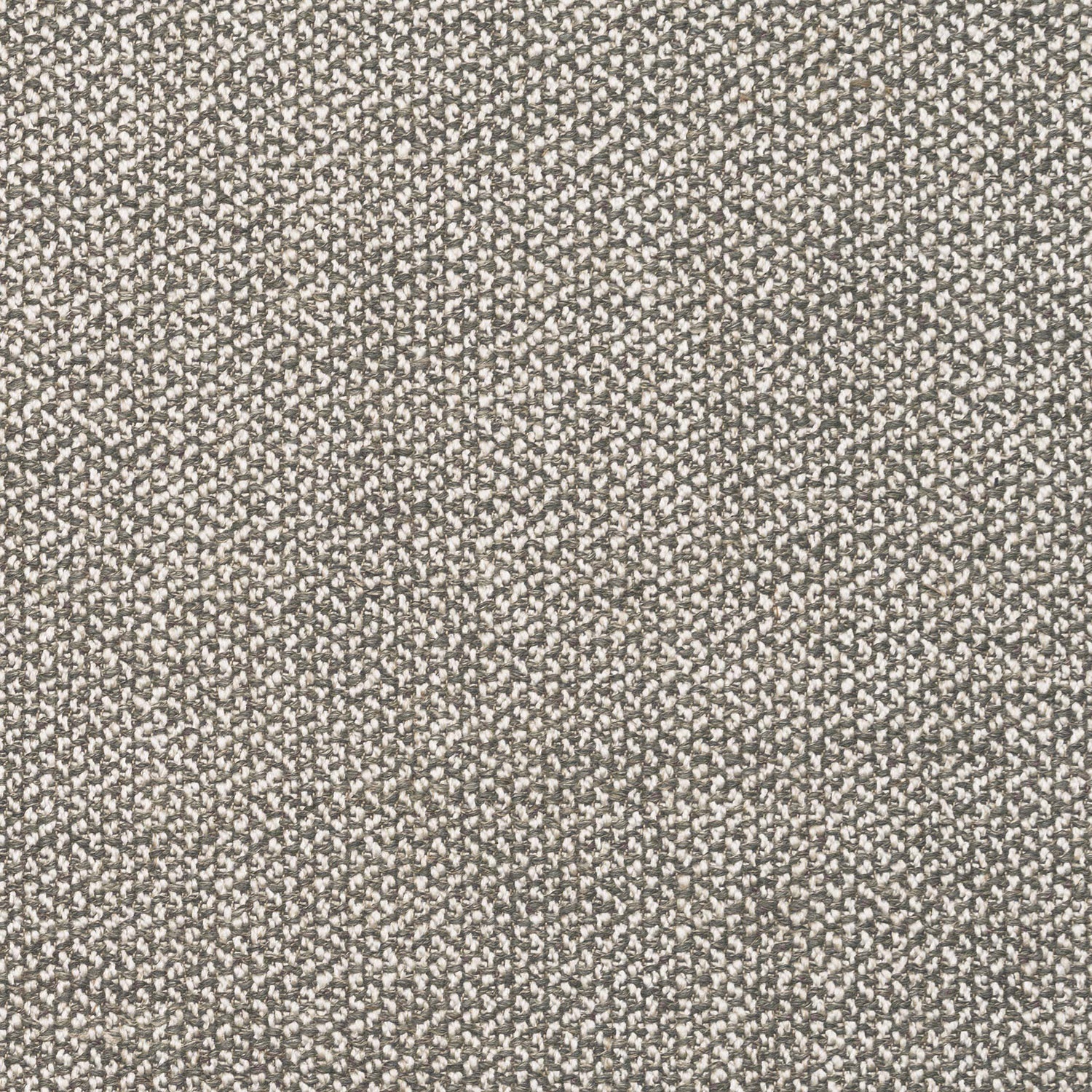
Composition: 32% PC – 29% CO – 26% VI – 10% LI – 3% PL
AVERAGE LIGHT FASTNESS: 4 / 5
Martindale: 30.000
FABRIC WIDTH: 140 cm
MAINTENANCE:
Composition: 45% PC – 19% CO – 12% LI – 12% PL – 12% VI
AVERAGE LIGHT FASTNESS: 4 / 5
Martindale: 30.000
FABRIC WIDTH: 140 cm
MAINTENANCE:
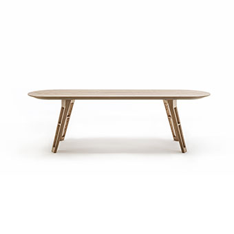
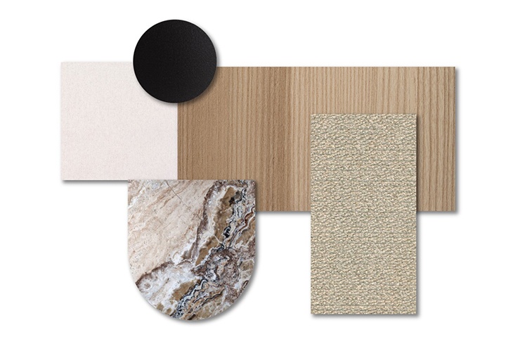
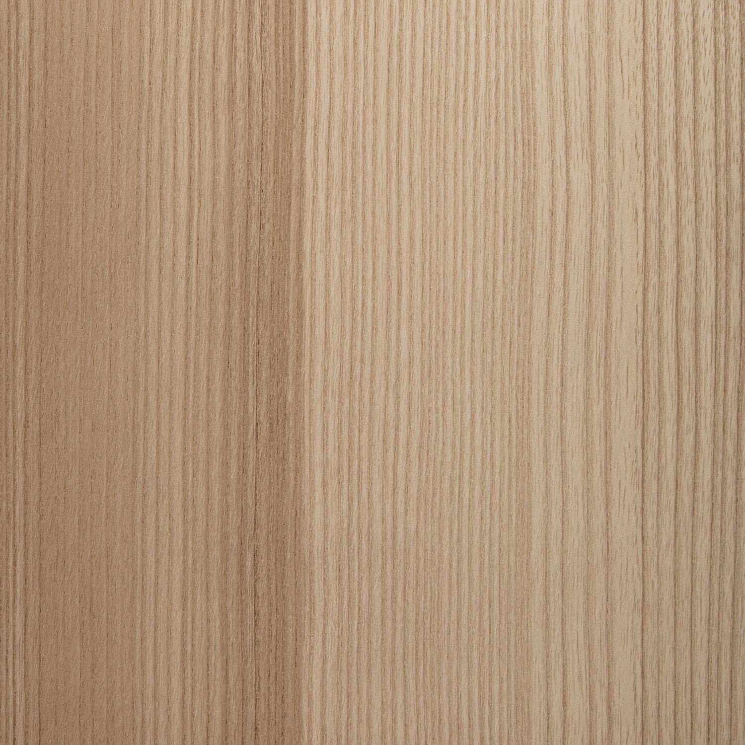
Composition: Il legno massello viene ricavato dal “cuore” del tronco dalla parte più resistente e massiccia (durame).
Tipology: Legno massello di frassino color sabbia.
TECHNICAL CHARATERISTICS: Materiale resistente e durevole.
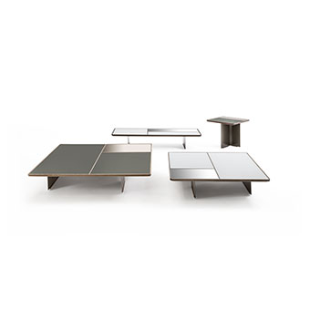
Composition: Lastra di vetro con uno strato di argento o alluminio, fissato per elettrolisi, nota per l’effetto riflettente.
Tipology: Superficie riflettente levigata.
TECHNICAL CHARATERISTICS: Lucidità e superficie riflettente.
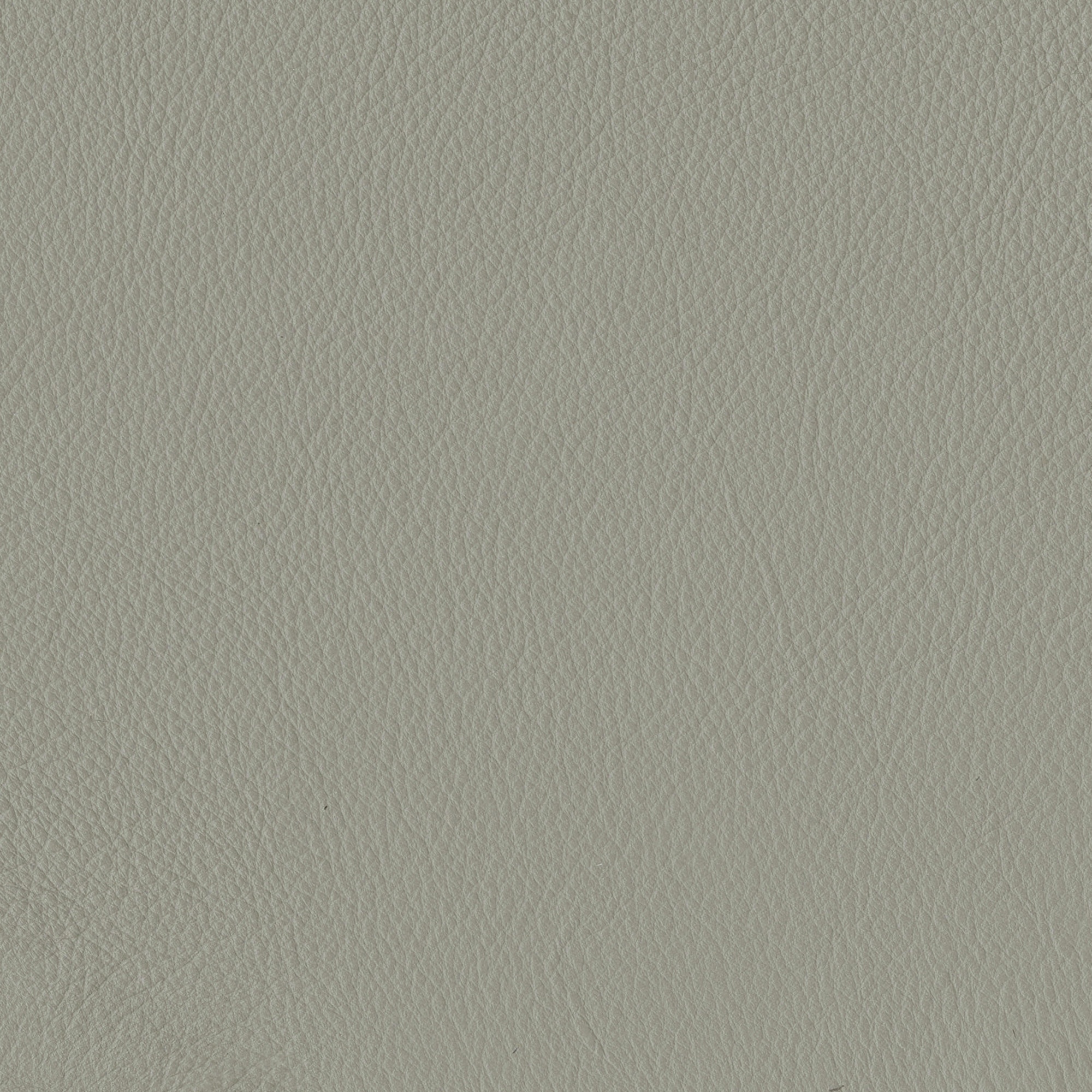
AVERAGE LIGHT FASTNESS: ≥ 3 scala dei blu
HIDE TYPE: Bovino Europeo
TANNING: Minerale
EFFECT/SURFACE: Anilina pieno fiore
THICKNESS: 1,1 - 1,3 mm
AVERAGE SIZE: ≥ 5,00 mq
FRICTION: secco ≥ 100 cicli – umido ≥ 25 cicli
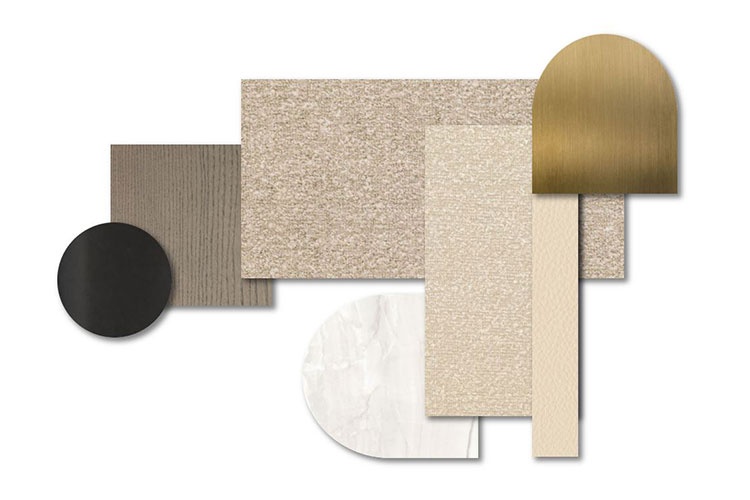
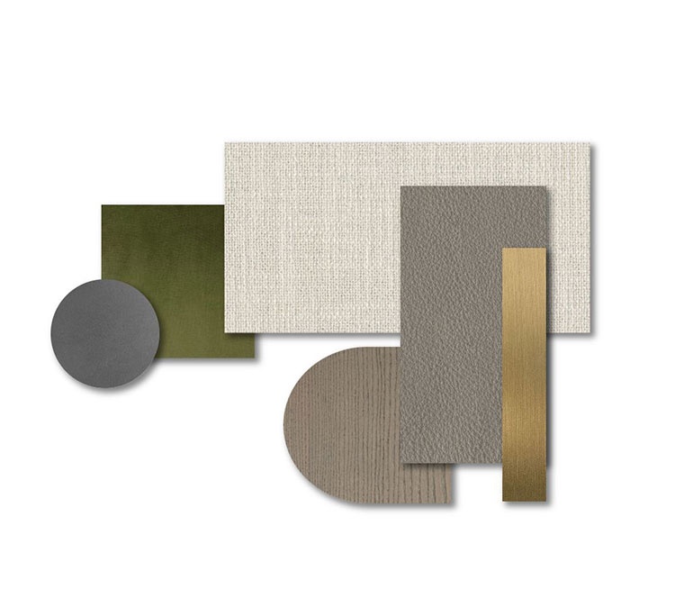
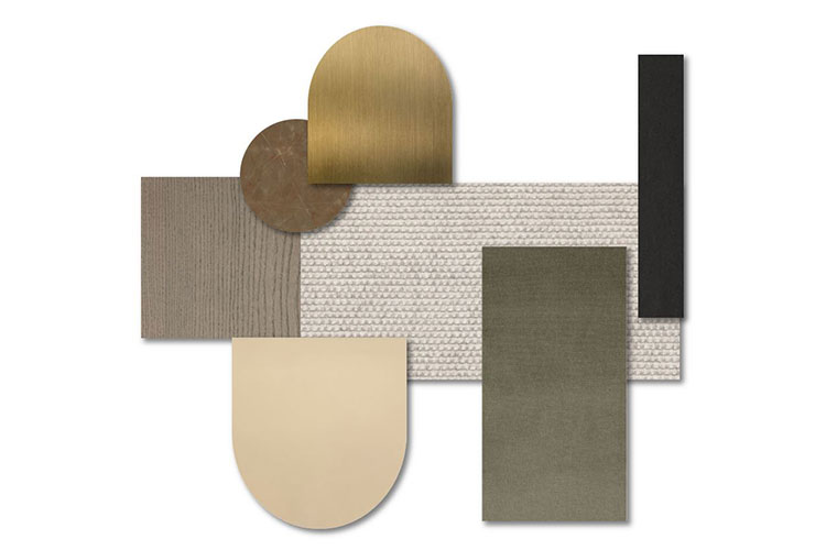
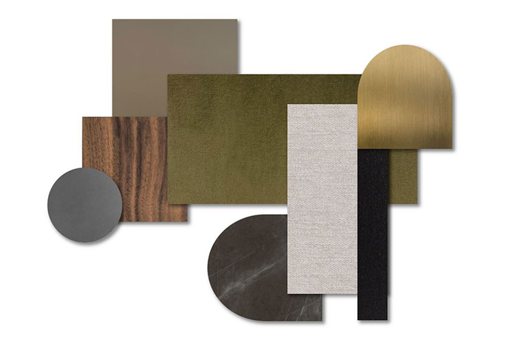
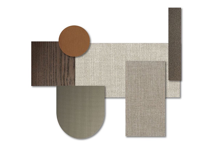
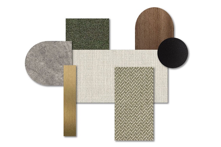
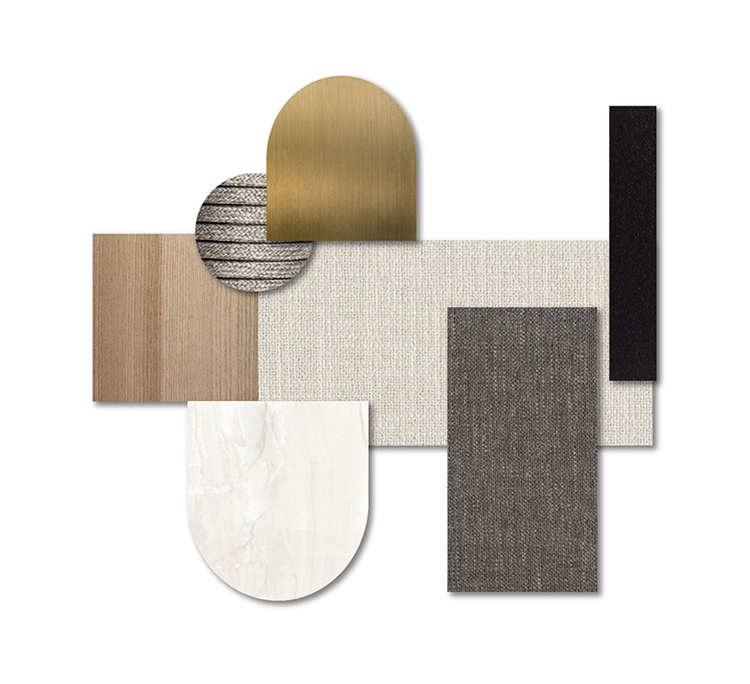
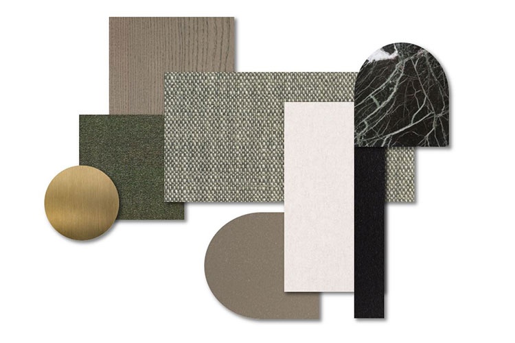
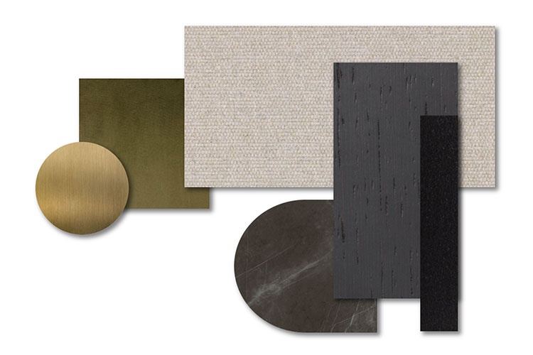
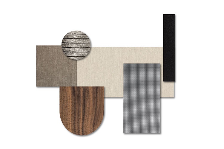
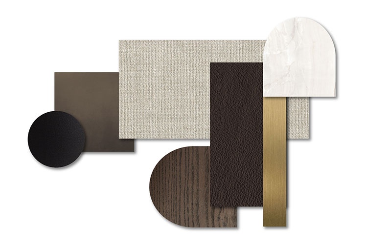
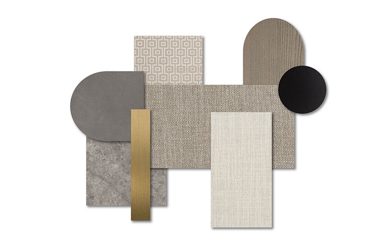
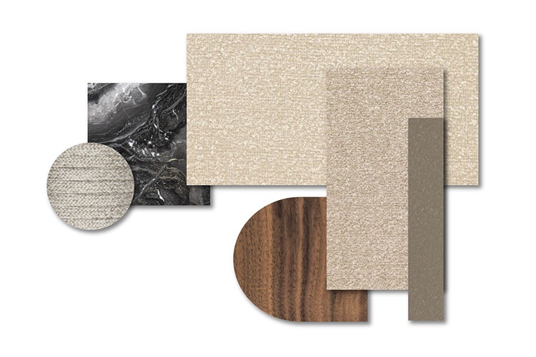
LIGHT HARMONY | 14